A Bold New Identity for Ajax
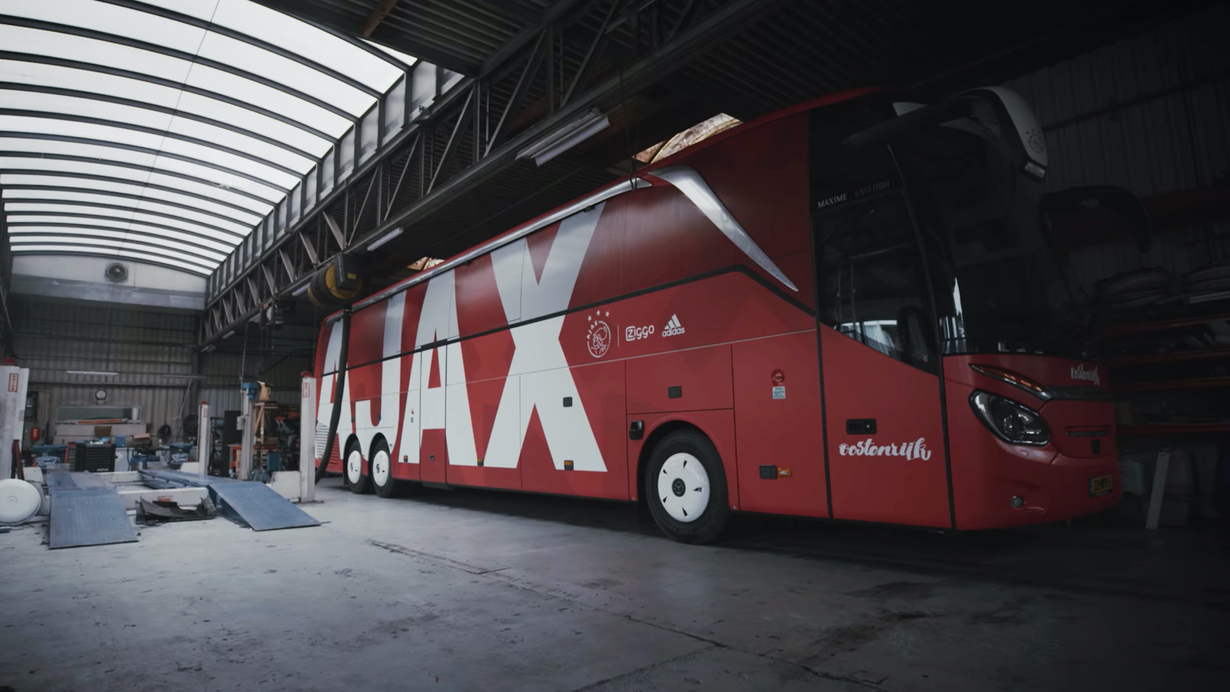
The new identity provides a clear and powerful direction, built around the club’s “For the Future” philosophy. Designed to be flexible and adaptable, it works across all media, from the team bus and massive stadium graphics to social media content.
Unifying the Pride of Amsterdam
This full identity overhaul strengthens Ajax’s visual presence while respecting its heritage. The crest and club colours remain untouched, but everything else was reimagined to unify the club’s many departments. The new wordmark and design system create consistency while allowing for variation and flexibility.
The Iconic Shirt Element
A key addition to the design language is the shirt icon, a minimalist representation of the Ajax shirt. This simple yet powerful symbol will is used across all media and, over time, has become as recognisable as the club’s crest itself.
A Cohesive Visual System
The identity relies on a limited set of colours and assets, carefully designed to fit within a structured grid. Though small, these elements play a crucial role in connecting the many different materials produced under the Ajax brand. Attention to detail ensures a seamless visual experience.
Transforming the Online Experience
Revamping Ajax’s digital presence was a massive task—and it’s still evolving. I helped design the UX & UI to create a cohesive online environment for Mijn.Ajax, the fanshop, news, ticketing, matchday takeovers, and more. The goal: a seamless, unified experience for every Ajax fan.
Links
Website
Roles
Visual Identity
Motion
Website & Webshop
Templates & Training
Credits
In co-operation with Ivo Schmetz while working at 310k